
What is a site? The unit of analysis, and why you probably do not need a grid
Source:vignettes/articles/unit-of-analysis.Rmd
unit-of-analysis.RmdBefore you fit anything, you have to decide what one row of your data is. That decision is called the unit of analysis, and for species data it is the question people get stuck on first: do I need to put my records into grid cells?
The short answer is no. This page explains what a row has to carry instead, untangles the three unrelated things that get called “cells” in this literature, and shows the consequences on toy data you can run yourself. Everything below uses only the installed package, base R, and twelve simulated sites; the whole page fits in a few seconds of computing.
This page is about the decision. For definitions of the package’s formula and model vocabulary — trait, unit, latent variable, loading — see Plain-English vocabulary.
# install.packages("remotes")
remotes::install_github("itchyshin/gllvmTMB")A count is a number of birds and an amount of looking
Write down a single observation: three Canada Warblers. On its own that number means nothing, because it does not say how hard anyone looked. Three warblers in five minutes and three warblers in a full morning are different pieces of evidence about the same place.
So a usable observation needs two things: where, and how much looking. The pair is the unit. Everything else in this article follows from that.
An eBird checklist already is such a
unit. One outing, one place, 45 minutes, three warblers — the checklist
is the counting window, and its duration is the effort. That is
why effort enters a model as offset(log_effort): the offset
says the expected count scales with how long you looked, without
spending a parameter on it. No grid is involved anywhere in that
sentence.
A point-count station is the same shape. The protocol defines the window — ten minutes, 100 m radius, this coordinate — and the protocol is the unit.
A grid cell is a third possibility: “all the birds recorded in this square”. That is the atlas tradition, and it is a perfectly legitimate unit. It is also entirely optional, and Section If you do grid, it is a choice with a price says what it costs.
Underneath all three is the same picture. Birds have an expected density that varies smoothly over the landscape, and any count is effort × density where you looked. When the place you looked is compact — a station, a stationary checklist — describing that place by its density at a point is an honest description, not an approximation you have to apologise for.
Three different things people call a “cell”
These three get conflated constantly, and they are unrelated. Keeping them apart resolves most of the confusion about gridding.
| What it is | Do you need it? | |
|---|---|---|
| Observation unit | What one count means: one place, one amount of looking. Usually an event — a checklist, a station visit — not an area. | Always. Your data cannot mean anything without it. |
| Grid cells | Squares laid over the landscape, used to define units or to pool records. | Never required. One optional way of choosing units. |
| The mesh | A triangular network the computer uses to represent a smooth surface. | Required by this package’s spatial models — and nothing to do with counting. |
The mesh is the one that causes trouble, because a picture of it looks grid-like. It is not a grid, and your data are never snapped to it. It is the computational device that lets a continuous density surface be estimated from a finite number of numbers: the surface is stored at the mesh vertices, and each observation’s exact coordinate is expressed as a weighted blend of the nearby vertices. Your coordinates stay exactly where they are.
The figure below draws all three over the same toy landscape used in the rest of this page: the same twelve records as events, as grid cells, and under a mesh.
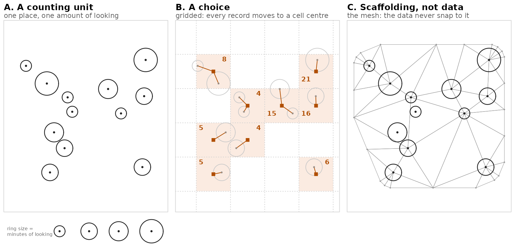
The same twelve records, three ways. A —
each record is one place and one amount of looking; the ring size is the
checklist’s duration in minutes, not a distance on the
map. B — the same records assigned to a 5-km
grid: every point is displaced to a cell centre (squares), and the bold
number is the cell’s pooled bird count. Where two faint
rings run into one square, two checklists have been merged — in the
top-left cell a 20-minute and a 90-minute visit become one cell with 110
minutes of looking behind its count of 8, and that 110 appears
nowhere in the panel: the effort behind a pooled count is
exactly what gridding makes invisible. C — the mesh
make_mesh() builds for these data: a scaffold for the
density surface, denser and wider than the data, and the twelve records
stay exactly where they were in A.
What counts as a “site” in your data frame
Whatever unit carries one location and one effort. Here are twelve of them — twelve checklists, three species, one row per species per checklist.
set.seed(20260818)

n_site <- 12
sites <- data.frame(
  site    = sprintf("checklist_%02d", seq_len(n_site)),
  X       = runif(n_site, 0, 20),          # projected coordinates, in km
  Y       = runif(n_site, 0, 20),
  minutes = sample(c(20, 45, 60, 90), n_site, replace = TRUE)
)
sites$log_effort <- log(sites$minutes / 60)  # effort, on the log scale

species   <- c("warbler", "vireo", "thrush")
abundance <- c(warbler = 0.6, vireo = 0.0, thrush = -1.2)  # thrush is scarce

dat <- do.call(rbind, lapply(species, function(s) transform(
  sites, trait = s,
  value = rpois(n_site, exp(abundance[[s]] + 0.08 * sites$X + sites$log_effort))
)))
dat$trait <- factor(dat$trait)
dat$site  <- factor(dat$site)
str(dat[, c("site", "X", "Y", "log_effort", "trait", "value")])
#> 'data.frame':    36 obs. of  6 variables:
#>  $ site      : Factor w/ 12 levels "checklist_01",..: 1 2 3 4 5 6 7 8 9 10 ...
#>  $ X         : num  0.203 5.839 3.709 12.197 4.302 ...
#>  $ Y         : num  18.32 6.3 2.76 14.94 8.61 ...
#>  $ log_effort: num  -1.099 -0.288 -0.288 0 0 ...
#>  $ trait     : Factor w/ 3 levels "thrush","vireo",..: 3 3 3 3 3 3 3 3 3 3 ...
#>  $ value     : int  2 3 1 9 2 16 4 3 2 3 ...
Read that str() as the target shape for your own data.
site labels the observation unit, X and
Y are its projected coordinates, log_effort is
the log of however you measure looking, trait is the
species, and value is the count.
If your own data start as a wide site × species matrix — one row per site, one column per species, which is how most community datasets arrive — the reshape to this long format is one call:
long <- tidyr::pivot_longer(wide, cols = -c(site, X, Y, log_effort),
                            names_to = "trait", values_to = "value")
The package can also take the wide frame directly through its
traits() formula grammar
(traits(sp1, sp2, ...) ~ ...); both roads lead to the same
fit. This article stays in long format because every integrated-data
example needs it.
Two things about the columns are worth saying out loud.
Project your coordinates before you do anything
spatial. A degree of longitude and a degree of latitude are
different physical distances everywhere except the equator, so a model
built on raw longitude/latitude treats unequal distances as equal.
add_utm_columns() will do the conversion. (Both
add_utm_columns() and make_mesh() follow the
interface established by sdmTMB, the
single-species spatial package this one’s spatial helpers descend from —
so if you have met them there, they behave as you expect.)
The site label is bookkeeping. It has to be there, and it has to be distinct per unit, but it carries no meaning of its own — the coordinates and the effort do all the work. That is worth demonstrating rather than asserting.
The label really is bookkeeping: a demonstration
Fit a small spatial model to the toy data. The only random structure in it is the spatial field, which is keyed on the coordinates.
mesh <- make_mesh(dat, c("X", "Y"), cutoff = 3)

fit <- gllvmTMB(
  value ~ 0 + trait + offset(log_effort) +
    spatial_latent(0 + trait | site, d = 1),
  data = dat, trait = "trait", unit = "site",
  family = poisson(), mesh = mesh, silent = TRUE
)
#> Warning: `spatial_latent()`'s `| site` grouping token is ignored.
#> ℹ At the default `rho = 1`, spatial keywords read locations from `mesh` (or
#>   `coords`), rather than the token right of `|`.
#> → Write `spatial_latent(..., | coords)` for clarity, and pass `mesh = ...` (or
#>   `coords = ...`) to supply the actual locations.

list(converged = fit$opt$convergence == 0,
     positive_definite_hessian = fit$sd_report$pdHess)
#> $converged
#> [1] TRUE
#>
#> $positive_definite_hessian
#> [1] TRUE
Now predict over a grid of new locations twice, changing nothing but the site label written in the unit column.
newd <- expand.grid(
  X     = seq(2, 18, length.out = 5),
  Y     = seq(2, 18, length.out = 5),
  trait = levels(dat$trait)
)
newd$log_effort <- 0   # predict at one hour of looking
newd$value      <- 0   # placeholder; not used by predict()

lab <- function(d, s) transform(d, site = factor(s, levels = levels(dat$site)))
p1 <- suppressMessages(predict(fit, newdata = lab(newd, "checklist_01"),
                               type = "link"))
p2 <- suppressMessages(predict(fit, newdata = lab(newd, "checklist_09"),
                               type = "link"))

cat("max |difference| between the two labels:", max(abs(p1$est - p2$est)),
    "\nover a prediction range of", round(diff(range(p1$est)), 3), "\n")
#> max |difference| between the two labels: 0
#> over a prediction range of 2.902
Exactly zero, across a surface that itself varies by 2.9 on the link scale. The label you write in the unit column is not consulted. What the model used was the coordinate you asked about.
This stops being true the moment your model has a genuine
unit-level random effect — a (1 | site) term, say.
Then the label picks out which random effect to add back, and it matters
a great deal. The rule is not “labels never matter”; it is “labels
matter exactly when the model has something keyed on them”.
The mesh is not your data
The mesh you just built has more vertices than you have sites:
Twelve sites, and the surface is represented at far more locations than that — including places no one ever visited, and a margin extending beyond the data. That is the point. The mesh is not a summary of where your data are; it is a scaffold for the density surface, dense enough to bend where the surface bends and extended beyond the data so the edges do not distort what is inside.
One practical consequence, which the package will tell you about if
you get it wrong: build the mesh from the same long-format data frame
you pass to gllvmTMB(), not from the one-row-per-site
table. The projection needs one row per data row.
The zeros are data
Notice that the toy table is a complete crossing: every site has a row for every species, whether or not that species was there. A good many of those rows are zeros, and the scarce species contributes most of them.
c(rows = nrow(dat), sites = nlevels(dat$site), species = nlevels(dat$trait),
  zero_rows = sum(dat$value == 0))
#>      rows     sites   species zero_rows
#>        36        12         3        11

table(species = dat$trait, absent = dat$value == 0)
#>          absent
#> species   FALSE TRUE
#>   thrush      6    6
#>   vireo       8    4
#>   warbler    11    1
The whole table fits in one picture, with the zeros left open.
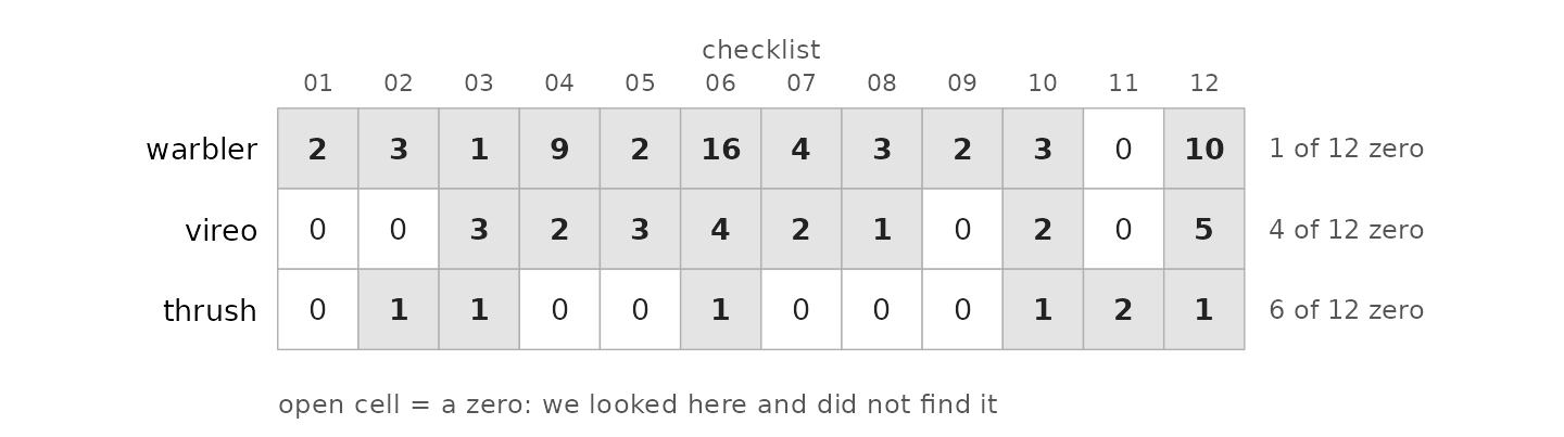
Every species has a row at every checklist, including where it was not found. The rectangle is complete — no gaps — and the open cells are the zeros. Each one is a record of looking and not finding, and the scarcer the species, the more of its evidence lives in those open cells.
Those zeros are not padding. Each one says we looked here and did not find this species, which is genuine evidence about where the species is not. A joint model of several species leans on them heavily.
This is also where a data source can quietly fail you. In eBird, those zeros exist only for complete checklists — the ones where the observer reported everything they detected. On an incomplete checklist, a missing species means nothing at all, and treating it as a zero invents evidence.
A raw presence-only download from GBIF (the Global Biodiversity Information Facility, the portal where species records from museums, surveys and citizen science are aggregated) has no zeros to give. That is not a defect to be patched by writing zeros where records are absent; it is a different data type with its own route. Fit it with the point-process quadrature device shown in Joint ecological intensity from opportunistic records, or see the presence-only section of the Canada Warbler article.
What your taxon’s data usually look like
The right unit is mostly decided by what your taxon’s data tradition gives you. A quick tour of the common cases:
| taxon | the common data | what one record is | the natural unit |
|---|---|---|---|
| birds | eBird checklists; point counts; atlas schemes | a count, with duration and (on complete checklists) inferable zeros | the checklist or station — the luxury case this site’s Warbler article uses |
| insects | iNaturalist photos; museum specimens; moth traps; butterfly transects | usually one photo at one point — no effort, no zeros; traps and transects are the exception, with real counts per trap-night or walk | the record itself (presence-only), or the trap/transect where one exists |
| plants | vegetation plots; herbarium specimens; iNaturalist | a plot gives cover or presence per quadrat — effort is the plot itself; a specimen is a presence with often-vague locality | the plot; specimens behave like museum insects |
| mammals | camera traps; sign surveys; opportunistic records | detections per camera-deployment — effort is trap-nights, built in | the camera deployment |
| amphibians | call surveys; iNaturalist | detection within a timed listening period | the survey visit |
What is common across all of them:
- Every taxon has an opportunistic, presence-only layer (iNaturalist, GBIF) — one observation at one point, no effort, no zeros.
- Each has one structured tradition, and its protocol is the natural unit: the checklist, the trap-night, the plot, the deployment. If your data came from a protocol, the protocol has already answered this article’s question for you.
- Effort is what turns records into counts you can model; zeros exist only where the protocol implies complete reporting. Where both are missing — a raw photo stream — you are in presence-only territory, whatever the taxon.
One honest boundary for insect-style data. When the question is a trend — is this species declining? — the established route for one-photo records really is grid cells: cells plus records of other species manufacture a visit-and-detection structure the raw stream lacks, and that occupancy-modelling tradition (van Strien et al. 2013, Opportunistic citizen science data of animal species produce reliable estimates of distribution trends if analysed with occupancy models) adds one layer this package does not have — a detection submodel, made estimable by treating each recording day’s species list as a repeat visit. Below that layer it is the same kind of model as the binary joint models fitted here; the layer is what the trend question needs. For habitat responses and intensity maps — this package’s territory — exact locations stay preferable, and more so for insects than for birds: insect-relevant covariates (microhabitat, host plants) change over short distances, which shrinks the cell sizes that count as harmless.
Counts from both sources are fine
One thing people do unnecessarily when combining an opportunistic source with a designed survey: binarise. If your structured survey recorded how many, not merely whether, keep the counts. Declaring both sources Poisson is accepted. (In integrated-model language each source is called an arm; the other articles use that word throughout.)
# an invented split of the toy data, purely to exercise the syntax
dat$isdm_source <- factor(rep(c("checklist", "station"),
                              each = n_site / 2, length.out = nrow(dat)))

both <- gllvmTMB(
  value ~ 0 + trait + offset(log_effort),
  data = dat, trait = "trait", unit = "site",
  family = isdm_sources(checklist = poisson(), station = poisson()),
  silent = TRUE
)

c(converged = both$opt$convergence == 0)
#> converged
#>      TRUE
isdm_sources() names each source and its observation
law; the data frame needs a matching isdm_source column.
Use
isdm_sources(checklist = poisson(), station = binomial("cloglog"))
when the structured arm really is detection/non-detection — but do not
throw away abundance you already have.
When the point approximation blurs
Treating a unit as a point is honest when the unit is compact. It gets less honest as the unit spreads out. A five-kilometre travelling checklist counted birds along a route; pinning it to a single coordinate introduces a position error you have inflicted on yourself.
Two practical responses:
- Filter. Restrict to stationary or short-distance checklists. eBird’s protocol and distance fields make this a one-line subset, and it is the cleanest fix.
- Accept the blur, if it is small relative to how fast the habitat changes. A one-kilometre travel distance is negligible where the habitat gradient turns over across fifty kilometres, and serious where it turns over across two.
That comparison — positional error against the correlation length of the thing you are modelling — is the whole question, and it has its own article: When one data source knows where it is and the other does not measures what blurred coordinates cost and gives you a ratio you can compute from your own raster.
If you do grid, it is a choice with a price
Gridding is legitimate. Sometimes it is forced on you: atlas data arrive as cells, or a data-sharing agreement releases only coarsened coordinates. But be clear about what it does. Assigning a record to a cell displaces it to the cell centre — every record moves, by up to half a cell diagonal — and then pools records that may have had very different effort behind them.
Displacement is positional error by another name, so the cost depends on cell size relative to the habitat’s correlation length — exactly the ratio from the previous section, and When one data source knows where it is and the other does not is where that cost is measured.
Two things are worth knowing before you pick a cell size.
First, results can genuinely depend on the grid. Analyses of the same records on different grids can disagree — not through anyone’s mistake, but because a quantity computed over areas depends on how the areas were drawn. Statisticians call this change of support; geographers call it the modifiable areal unit problem. Both names describe the same fact: the answer belongs to the grid as much as to the landscape.
Second, coarsening does not fix positional error. It is tempting to reason that a bigger cell swallows a small location error, so a coarse grain is the safe choice. It is not: Gábor, Jetz, Lu and colleagues tested exactly that idea, and their title reports the answer — Positional errors in species distribution modelling are not overcome by the coarser grains of analysis (2022). Coarsening trades one loss for another rather than removing the first.
Where to go next
- Not sure which model your data allow? Start at the front door: Start here: which SDM do your data allow?.
- Definitions of the package’s model vocabulary: Plain-English vocabulary.
- A full worked model on species records, with a map at the end: An integrated SDM end to end.
- Presence-only records on their own: Joint ecological intensity from opportunistic records.
- What imprecise coordinates cost, and the ratio that decides it: When one data source knows where it is and the other does not.
- How much structured survey you need alongside opportunistic records: How much survey do you need?.
References
Gábor, L., Jetz, W., Lu, M., Rocchini, D., Cord, A. F., Malavasi, M., Zarzo-Arias, A., Barták, V., & Moudrý, V. (2022). Positional errors in species distribution modelling are not overcome by the coarser grains of analysis. Methods in Ecology and Evolution, 13, 2289–2302.
van Strien, A. J., van Swaay, C. A. M., & Termaat, T. (2013). Opportunistic citizen science data of animal species produce reliable estimates of distribution trends if analysed with occupancy models. Journal of Applied Ecology, 50, 1450–1458.