
How big does an integrated survey design need to be?
Source:vignettes/articles/integrated-survey-design.Rmd
integrated-survey-design.RmdExperimental. The model on this page is fitted through the ordinary
gllvmTMB()entry point — there is no separate integrated-model function — but the route is experimental: the interface may change without deprecation, and no released capability claim is made.
The question
You have tens of thousands of opportunistic portal records and money for a limited structured survey. The portal records arrive where people go; the survey is small but has known effort. Before writing the grant, you need to answer a question that is not about estimation at all:
where should the survey effort go, and is the design big enough?
This page is about judging a design before you fit it. Its companion, Integrating opportunistic records with a designed survey, asks the estimation question — do the two sources agree on one shared gradient? — and answers it with a single fit. Read that one first if you want the model explained. Read this one if you are deciding how many cells to lay out.
The short version of the answer, and the whole argument of this page:
Spatial replication helps if and only if per-cell information is preserved. Extra cells buy identifiability that extra records piled into the same cells do not. That is a mechanism with conditions attached, not a rule of thumb — the conditions are set out in What the curve does not tell you, and they matter more than the headline.
Everything here is relative intensity. Presence-only data cannot identify absolute abundance, occupancy, or detectability (Fithian et al. 2015, Methods in Ecology and Evolution 6:424–438), and nothing on this page changes that.
The design levers
Both sources see the same ecological state for species in cell ,
with
a measured habitat covariate and
an unmeasured spatial gradient carried by a latent field with species
loadings
.
The portal branch adds a per-species reporting level
(fitted as trait:isdm_gbif — the identification device that
stops presence-only records from claiming an absolute intensity) and an
accessibility bias with species-specific coefficients
;
the survey branch is a complementary-log-log (cloglog)
detection/non-detection likelihood with known visit support. The
companion article writes both likelihoods out in full.
Three things are yours to choose, and they are not interchangeable:
- the number of cells, — how far the design reaches, and how many independent looks the shared field gets;
- the per-cell record support — how much portal effort lands in a typical cell;
- the survey replication — how many visits each surveyed cell receives.
The rest of this page is about the first two, because that is where the measured evidence sits.
Audit your own design first
The audit below needs no model. It is arithmetic on your own data, and it is the step that decides whether the design curve later on this page is even relevant to you.
We use a simulated three-species desert lizard guild on an arid south-western landscape; the species names are invented. Portal records concentrate near roads, so accessibility drives portal effort while the survey’s support is designed.
n_lon <- 10; n_lat <- 8
grid <- expand.grid(lon = seq(0, 1.0, length.out = n_lon),
                    lat = seq(0, 0.8, length.out = n_lat))
grid <- grid[order(grid$lat, grid$lon), ]
n_cell  <- nrow(grid)
cells   <- paste0("cell_", seq_len(n_cell))
species <- c("spinytail", "bandedgecko", "dunerunner")   # simulated guild

## measured habitat, an unmeasured shared gradient, and road accessibility
x <- as.numeric(scale(grid$lon))
u <- 0.8 * sin(pi * grid$lat / 0.8) * cos(pi * grid$lon / 1.0)
b <- as.numeric(scale(-grid$lat + 0.3 * cos(2 * pi * grid$lon)))

alpha  <- c(-0.2,  0.2, 0.4)
beta   <- c( 0.6, -0.4, 0.5)
lambda <- c( 0.9,  0.7, -0.6)
gamma  <- c( 0.5, -0.3, 0.2)

eta <- outer(u, lambda) + sweep(outer(x, beta), 2, alpha, "+")

## portal effort follows accessibility; survey support is uniform by design
a_g <- 3 * exp(0.4 * b + rnorm(n_cell, sd = 0.2))
a_s <- rep(0.9, n_cell)

base <- expand.grid(cell_id = cells, trait = species,
                    stringsAsFactors = FALSE)
base <- base[order(match(base$cell_id, cells), match(base$trait, species)), ]
ci <- match(base$cell_id, cells)
si <- match(base$trait, species)

## the contract's source labels are fixed strings, "gbif" and "survey";
## they name the two roles, not a particular data provider
portal <- transform(base, source = "gbif", support = a_g[ci],
  lon = grid$lon[ci], lat = grid$lat[ci],
  value = rpois(nrow(base),
    a_g[ci] * exp(eta[cbind(ci, si)] + b[ci] * gamma[si])))

pa <- do.call(rbind, lapply(1:2, function(v) transform(base,
  source = "survey", support = a_s[ci],
  lon = grid$lon[ci], lat = grid$lat[ci],
  value = rbinom(nrow(base), 1,
    -expm1(-a_s[ci] * exp(eta[cbind(ci, si)]))))))

rows <- rbind(portal, pa)
c(cells = n_cell, portal_rows = nrow(portal), survey_rows = nrow(pa))
#>       cells portal_rows survey_rows
#>          80         240         480
Now the audit itself. Three numbers decide whether your cell count means what you think it means.
recs <- tapply(portal$value, portal$cell_id, sum)
recs <- recs[cells]

audit <- c(
  cells                = length(recs),
  total_records        = sum(recs),
  median_per_cell      = median(recs),
  cells_with_no_record = sum(recs == 0),
  share_in_top_decile  = sum(sort(recs, decreasing = TRUE)[
                              seq_len(ceiling(0.1 * length(recs)))]) / sum(recs)
)
round(audit, 3)
#>                cells        total_records      median_per_cell
#>               80.000             1230.000               11.000
#> cells_with_no_record  share_in_top_decile
#>                0.000                0.306
share_in_top_decile is the one to watch. Perfectly even
effort would put 0.10 of the records in the best-sampled tenth of cells;
this deliberately mild simulation puts about 0.31. When that number
climbs toward 1, the effective number of well-supported cells
is far below your cell count, and a plan to “add more cells” will in
practice spread the same records thinner. The design curve below was
measured under the opposite condition — per-cell support held fixed
while cells were added — and it does not describe the thinning case.
op <- par(mfrow = c(1, 2), mar = c(4.2, 4.2, 2.2, 1.0), cex = 0.9)

hist(recs, breaks = 12, col = "grey85", border = "white",
     main = "Records per cell", xlab = "portal records in a cell", ylab = "cells")
abline(v = median(recs), lty = 2)

srt <- sort(recs, decreasing = TRUE)
plot(seq_along(srt) / length(srt), cumsum(srt) / sum(srt), type = "l", lwd = 2,
     xlim = c(0, 1), ylim = c(0, 1), main = "Concentration of effort",
     xlab = "cumulative share of cells", ylab = "cumulative share of records")
abline(0, 1, lty = 3)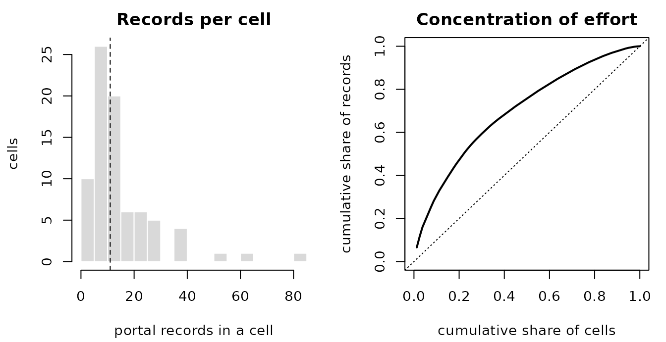
Design audit of the simulated portal stream. Left: records per cell, showing how far the per-cell support spreads. Right: the cumulative share of all records against the cumulative share of cells, ranked from best- to worst-sampled; the diagonal is even effort. The gap between the curve and the diagonal is the part of your cell count that is not doing the work you think it is.
par(op)One fit, to fix the workflow
The design question does not need a big fit, but it does need the workflow to be concrete. This is the same route the companion article walks through, on a deliberately small design, so that the rest of the page has something to point at.
Four columns do the integrating work: a portal-row indicator so that portal-only terms are structurally absent from the survey likelihood, a log support offset carrying known effort, a structurally zero accessibility covariate on survey rows, and a per-row family selector.
dat <- rows
dat$trait   <- factor(dat$trait)
dat$cell_id <- factor(dat$cell_id)

dat$isdm_gbif    <- as.integer(dat$source == "gbif")   # 1 for portal rows, 0 otherwise
dat$log_support  <- log(dat$support)                   # known effort
dat$env    <- x[match(as.character(dat$cell_id), cells)]
dat$access <- ifelse(dat$isdm_gbif == 1L,              # portal-only, so a
                     b[match(as.character(dat$cell_id), cells)], 0)  # zero,
                                                       # never an NA
dat$isdm_family <- factor(
  ifelse(dat$source == "gbif", "gbif", "survey_pa"),
  levels = c("gbif", "survey_pa"))
fam <- list(gbif = poisson(), survey_pa = binomial(link = "cloglog"))
attr(fam, "family_var") <- "isdm_family"
The route is intrinsically long-format: a per-row family selector has
no wide-data-frame equivalent, because a wide frame has one row per unit
and this model needs one row per (cell, species, source). There is no
traits(...) twin for this call.
mesh <- make_mesh(dat[, c("lon", "lat")], c("lon", "lat"), cutoff = 0.12)
fit <- gllvmTMB(
  value ~ 0 + trait + trait:env + trait:isdm_gbif + trait:access +
    offset(log_support) +
    indep(0 + trait | cell_id) +
    spatial_latent(0 + trait | cell_id, d = 1),
  data   = dat,
  trait  = "trait",
  unit   = "cell_id",
  family = fam,
  mesh   = mesh,
  silent = TRUE
)
fit$opt$convergence
#> [1] 0
A converged optimizer is not an admissible fit, and admissibility is the very thing this page is about — so run the check here rather than taking the convergence code at face value:
health <- check_gllvmTMB(fit)
health[health$component %in% c("optimizer_convergence", "pd_hessian"),
       c("component", "status")]
#>               component status
#> 1 optimizer_convergence   PASS
#> 4            pd_hessian   PASS
Both read PASS on this small demonstration fit
(pd_hessian — whether the curvature at the optimum is
trustworthy; the two-source
article explains a WARN). Hold that in mind for the
design curve below, where the same admissibility rate is only 0.555 even
at 2,250 cells — this demo drew a passing hand, and the curve says how
often that happens by design size.
The portal-bias coefficients come back in the order
factor() chose, so realign the simulated truth before
comparing:
idx <- grep("access", fit$X_fix_names)
tab <- rbind(truth    = gamma[match(levels(dat$trait), species)],
             estimate = unname(fit$opt$par[idx]))
colnames(tab) <- levels(dat$trait)
round(tab, 2)
#>          bandedgecko dunerunner spinytail
#> truth           -0.3       0.20      0.50
#> estimate        -0.2       0.14      0.48
Eighty cells is roughly a fifth of the smallest design in the evidence below, and these are single-draw numbers, so read them as a demonstration that the route runs and the columns line up rather than as a recovery result. They do carry one design lesson, though, and it is the reason this page exists: different quantities in the same model have different design requirements. An accessibility coefficient is a fixed effect that every cell contributes to, so it is comparatively cheap. The amplitude of a spatial field is not — it is estimated from how the field varies across cells, so it is the quantity that has to be bought with cells. That is what the next section measures.
The design curve
The numbers in this section come from a simulation study with known parameter values: 1,600 fits, no errors. The domain was grown at fixed spatial range and fixed cell size, so the number of cells rises without diluting the sampling in any one cell. That separation is the point of the design; it is what lets the curve say something about cells specifically rather than about “more data” in general.
The table below reproduces the study results. Running this article does not repeat the simulation study; a single fit at the largest design point took about 107 s.
## per-cell effort level E = 2 (the higher of the study's two settings)
design_curve <- data.frame(
  n_cell  = c(  360,   810,  1440,  2250),
  med_rel = c(0.993, 0.985, 0.981, 0.633),  # lower is better
  pd_rate = c(0.330, 0.430, 0.455, 0.555),  # higher is better
  cos95   = c(0.255, 0.375, 0.470, 0.575),  # higher is better
  conv    = c(0.940, 0.985, 0.995, 1.000)   # higher is better
)

## the lower effort level, E = 1: only the two endpoints were reported
e1_endpoints <- data.frame(n_cell  = c(  360,  2250),
                           med_rel = c(0.997, 0.982))

design_curve
#>   n_cell med_rel pd_rate cos95  conv
#> 1    360   0.993   0.330 0.255 0.940
#> 2    810   0.985   0.430 0.375 0.985
#> 3   1440   0.981   0.455 0.470 0.995
#> 4   2250   0.633   0.555 0.575 1.000
What the four columns are:
-
med_rel— the median relative error in the recovered amplitude of the spatial field. This is the study’s main accuracy measure, and the prespecified threshold was 0.25 or below. Lower is better. -
conv— the proportion of fits that converged. -
pd_rate— the proportion of fits reaching an admissible solution, in the positive-definite sense the package checks on every fit. -
cos95— the study’s agreement score between the recovered and the true gradient direction. Higher is better.
Every one of the four moves monotonically in the right direction as
cells are added, and conv reaches 1.000.
Read pd_rate before taking much comfort from that.
conv reaching 1.000 is the optimizer declaring
itself satisfied; pd_rate is the share of those fits whose
curvature is actually admissible, and at the largest design tested —
2,250 cells — it is 0.555. Barely more than half. It
rises from 0.330, so the trend is real, but it is the axis furthest from
solved and its destination lies outside the measured span. Adding cells
at fixed per-cell support improves admissibility; on this
evidence it does not yet deliver it.
op <- par(mfrow = c(1, 2), mar = c(4.4, 4.4, 2.6, 1.0), cex = 0.9)

## --- amplitude ---
plot(design_curve$n_cell, design_curve$med_rel, type = "n", log = "x",
     xlim = c(320, 20000), ylim = c(0, 1.05),
     xlab = "cells (log scale)", ylab = "median relative amplitude error",
     main = "Amplitude: better, not yet good")
rect(2600, -0.1, 30000, 1.2, col = grey(0.92), border = NA)
text(7600, 0.86, "beyond the\nmeasured span", cex = 0.8, col = grey(0.35))
box()
abline(h = 0.25, lty = 3)
text(430, 0.30, "accuracy threshold 0.25", cex = 0.75, adj = 0)
lines(e1_endpoints$n_cell, e1_endpoints$med_rel, type = "b",
      pch = 1, lty = 2, col = grey(0.45))
lines(design_curve$n_cell, design_curve$med_rel, type = "b", pch = 19, lwd = 2)
legend("bottomleft", bty = "n", cex = 0.75,
       legend = c("higher effort (E = 2)", "lower effort (E = 1), endpoints"),
       pch = c(19, 1), lty = c(1, 2), col = c("black", grey(0.45)))

## --- the higher-is-better axes ---
plot(design_curve$n_cell, design_curve$conv, type = "n", log = "x",
     xlim = c(320, 2600), ylim = c(0, 1.05),
     xlab = "cells (log scale)", ylab = "proportion of fits",
     main = "Admissibility and agreement")
for (j in seq_along(v <- c("conv", "pd_rate", "cos95"))) {
  lines(design_curve$n_cell, design_curve[[v[j]]], type = "b",
        pch = c(15, 17, 18)[j], lty = j, lwd = 2, col = grey(c(0, 0.35, 0.6)[j]))
}
legend("bottomright", bty = "n", cex = 0.75,
       legend = c("converged", "PD Hessian (admissible)",
                  "direction agreement (cos > 0.95)"),
       pch = c(15, 17, 18), lty = 1:3, col = grey(c(0, 0.35, 0.6)))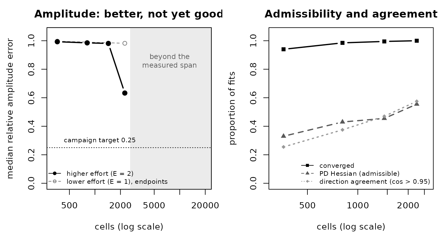
What extra cells buy, at fixed spatial range and fixed cell size. Left: median relative amplitude error falls, but does not reach the prespecified 0.25 threshold within the measured span; the shaded region is beyond any measurement, and the grey open points are the lower effort level (endpoints only). Right: the three higher-is-better axes, all monotone. The horizontal axis is on a log scale in both panels.
par(op)Why it is cells, and not records
A monotone improvement on its own is weak evidence: almost any axis improves when you add data. What makes this a statement about cells is a second arm of the same simulation study, in which the spatial range was shrunk instead — which also raises the number of patches the field spans, but does so by making each patch smaller relative to the sampling. That arm moved in the opposite direction on every one of the four axes.
Two arms, both increasing spatial replication, opposite outcomes. The difference between them is whether per-cell information survived the change. Hence the conditional form:
Spatial replication helps if and only if per-cell information is preserved. Cells buy what records cannot.
This is also why the audit comes before the curve. Adding cells to a design whose records are already concentrated in a tenth of the map is closer to the range-shrink arm than to the domain-growth arm, and the curve will not describe it.
What the curve does not tell you
This is the more important half of the page, and it is deliberately longer than the claim.
The accuracy threshold was not reached. At the
study’s prespecified threshold (med_rel at or below 0.25),
2,250 cells is not enough. The last doubling moved the
amplitude error from 0.98 to 0.63 — real progress, and still nowhere
near the threshold. Any figure for how many cells would be
enough is an extrapolation past the last measured point. Extrapolating
the observed decline suggests roughly two to three further doublings, on
the order of 10,000 to 20,000 cells; this is an extrapolation rather
than a measurement.
Cost grows with cells. Fit time rose roughly linearly with cell count — about 9.6 s at 360 cells and 107 s at 2,250. The next doubling requires a planned, resource-intensive simulation, not something you run while you wait.
The regime is narrow. These numbers were measured at a fixed spatial range, a fixed cell size, two per-cell effort levels, and one synthetic data-generating process with known truth. They are not a power analysis for any real taxon, grid, or question.
Specifically, you cannot conclude from this page that:
- some particular number of cells is right for your study — the curve fixes range and cell size, and your field’s range relative to your cell size is the quantity that actually drives the result;
- 2,250 cells is sufficient — under the study’s prespecified threshold it is not;
- 10,000 to 20,000 cells is sufficient — that is an extrapolation beyond every measured point, and it may be optimistic or pessimistic;
- adding cells helps in your design — if adding cells thins your per-cell records, that is the arm that moved the other way;
- anything at all about absolute abundance, occupancy, or detectability — the design is relative-intensity throughout;
- the same ordering holds for a different taxon, likelihood, bias structure, or number of species — none of those were varied;
- admissibility becomes likely if you simply add cells — at the
largest design measured,
pd_rateis 0.555, so roughly one fit in two still fails the positive-definiteness check. Growing the domain moves that number in the right direction and does not finish the job; - the bias coefficients are identified regardless of your covariates — the simulation generated its accessibility covariate independently of habitat, and that independence is a design requirement of your data, not a property the model supplies.
What you can take away is the mechanism and the audit: find out whether your own design would hold per-cell support fixed as it grows, because that condition is what separates the two arms.
What this route does and does not cover
Covered here: a design audit you can run on your own
two-source data before fitting anything, and a worked assembly-and-fit
of the integrated route — one presence-only count stream and one
detection/non-detection survey sharing an ecological linear predictor,
with a portal-only bias term and known per-row support, through
gllvmTMB().
Limits of the design guidance: it rests on a simulation study with known parameter values in a single narrow regime. The direction of the effect and its conditional form are what the evidence supports; the location of the accuracy frontier is not established, and the estimates from the small fit above are illustration, not validation.
Not available: a power calculator or a recommended
cell count for a real study; calibrated confidence intervals for this
route; weighting one source’s contribution against the other’s; and any
measured result outside the fixed-range, fixed-cell-size regime
described above. (More than two sources is available through the
isdm_sources() declaration shown in More than two sources —
but this simulation study evaluated the two-source design only.)
See also
- Integrating opportunistic records with a designed survey — the estimation workflow this page’s design audit is meant to precede.
- More than two sources — the declaration route for three or more sources.
- What do repeated survey visits add to an integrated model? — the visit-structure question.
References
Fithian, W., Elith, J., Hastie, T. and Keith, D.A. (2015) Bias correction in species distribution models: pooling survey and collection data for multiple species. Methods in Ecology and Evolution 6, 424–438.
Isaac, N.J.B., Jarzyna, M.A., Keil, P., et al. (2020). Data integration for large-scale models of species distributions. Trends in Ecology & Evolution 35, 56–67. https://doi.org/10.1016/j.tree.2019.08.006
Miller, D.A.W., Pacifici, K., Sanderlin, J.S. and Reich, B.J. (2019). The recent past and promising future for data integration methods to estimate species’ distributions. Methods in Ecology and Evolution 10, 22–37. https://doi.org/10.1111/2041-210X.13110
Simmonds, E.G., Jarvis, S.G., Henrys, P.A., Isaac, N.J.B. and O’Hara, R.B. (2020). Is more data always better? A simulation study of benefits and limitations of integrated distribution models. Ecography 43, 1413–1422. https://doi.org/10.1111/ecog.05146