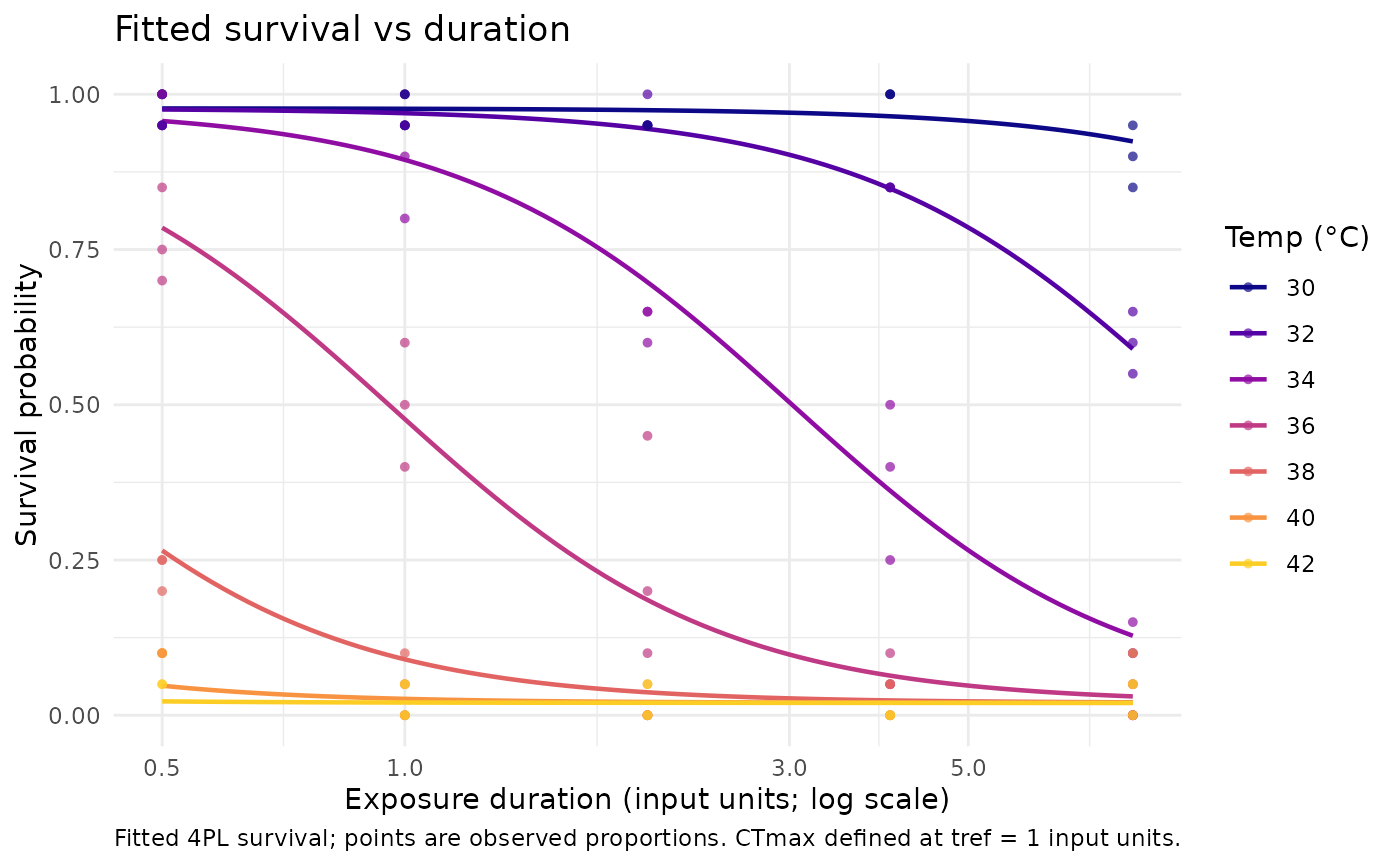
plot_survival_curves() draws the fitted survival probability as a function
of exposure duration (on a log10 x-axis), one curve per temperature, with the
observed survival proportions overlaid as points. For a grouped fit the
curves are faceted by group.
Arguments
- fit
A
profile_tlsfit fromfit_tls().- temps
Numeric vector of temperatures to draw curves for. Defaults to the distinct observed temperatures (capped at a readable number).
- times
Numeric vector of durations to evaluate the smooth curve over. Defaults to a log-spaced sequence over the observed duration range.
- ...
Reserved; must be empty.
Examples
d <- simulate_tls(family = "binomial", CTmax = 36, z = 4, seed = 1)
fit <- fit_tls(d, y = survived, n = total, time = duration, temp = temp,
               family = "binomial", tref = 60)
plot_survival_curves(fit)